
Everything she does
Fourteen things, and what each one costs.
Ten of them cost nothing at all. Three are free with a ceiling. One is premium only. It is marked on every single one, so you never have to find out by tapping.
This page is long on purpose. A period tracker asks for the most personal record you keep, and you should be able to read exactly what it does with that before you install it, not after.
The cycle
All of this runs on your phone. No account, no signal, no server in the loop.
You can install Lumie, answer six short questions, and use every part of this section forever without ever telling us who you are. That is not a trial. It is how the app is built.
Predictions that admit what they do not know
FreeLumie weighs your last twelve cycles, the recent ones heaviest, and gives you a range of days rather than one confident looking date. Under that range sits a confidence level she has to earn. Below two cycles, or when your history swings too widely, she says she is still learning instead of inventing a day for you.
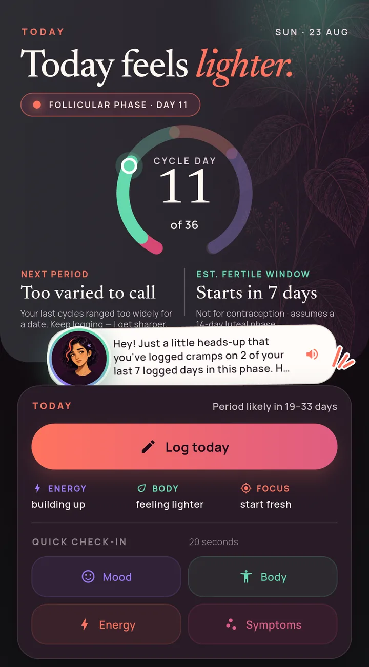
The number in the middle is your cycle day. The ring around it is the whole cycle at a glance: what has already happened, where you are now, and what she expects next. Under it are the two dates most people open the app for, the next period and the fertile window, each with the honest caveat attached rather than buried.
Long cycles are kept, not discarded. Anything from a short cycle to a ninety day gap counts as real data. That matters if you have PCOS, have just come off a method, are post partum, or are simply irregular and tired of apps that treat that as an error.
On the pill, the patch or the injection, ovulation is suppressed, so the fertile window is hidden entirely rather than guessed at. Lumie is not a contraceptive and does not pretend to be one. Where the app has to make an assumption, such as the fourteen day luteal phase every tracker uses, it prints the assumption next to the answer.
- Cycle length
- 21 to 45 days, and history back 400 days
- Weighting
- Up to 12 cycles, recent ones count most
- Confidence
- Earned on logged history, never on payment
- Runs
- Entirely on the phone, offline
A calendar that holds still
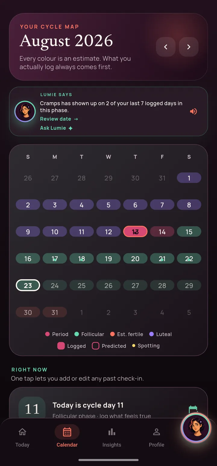
FreeFour colours, one meaning each, and they never move. They do not change when you switch to light mode and they do not change when you pick a different accent for the app. A theme repaints everything around the cycle, never the cycle itself. The four are on the home page.
What you logged and what she predicted are drawn differently, so you are never reading a guess as a fact. A day you filled in yourself is solid. A day she expects is outlined. That difference is the whole reason the calendar is trustworthy at a glance.
Long press any day to fill it in after the event, which is how most days actually get logged. Tap the month name to jump straight to any month or year instead of paging through, and a Today button brings you back the moment you are anywhere else.
Under the grid sits the same day in words: which phase it falls in, what you recorded, and what Lumie makes of it. The calendar answers where; the card under it answers so what.
Logging, in about twenty seconds
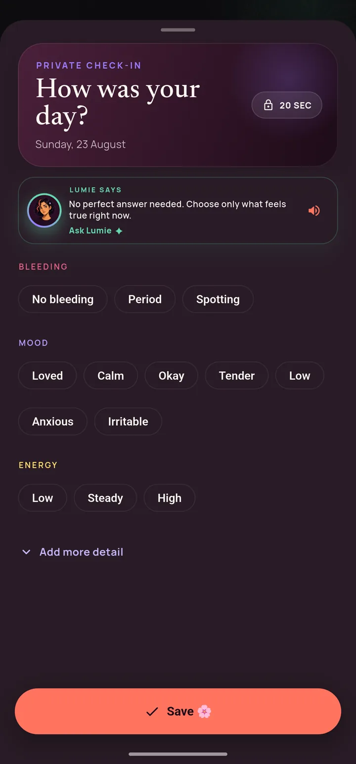
FreeBleeding, flow, mood and energy are on screen. Everything else sits behind a single “add more detail” control, and it opens itself if the day already has some. A quick day stays quick and a heavy day is never a hunt.
Thirty eight symptoms across seven groups, and each one takes a severity and an impact. Whether it was mild or severe is a different question from whether it stopped you doing something, and only the second one tells a doctor much. Tap a symptom to log it, hold it to say how bad it was.
Every optional answer can be un answered. Tap the chosen chip again and it clears, including the severity and any note you attached to it. Nothing you record is a one way door.
There is one Save, never a per step commit, so a half finished sheet cannot overwrite a real entry. And from the home screen the four quick tiles deep link straight into the section they name, so logging a mood is two taps rather than a scroll.
- Bleeding
- Flow, plus three heavy flow follow ups
- Wellbeing
- Mood, energy, sleep, stress
- Fertility
- Basal temperature, LH tests, discharge
- Yours
- Medication, your own tags, a note
What she notices
The part that sounds like it should be premium, and is not.
Insights open up as you log, never as you pay. Two completed cycles is the whole requirement, and the app tells you how close you are rather than showing you a locked screen.
Insights from your history, not an average
FreeThree views, and each answers a different question you have probably asked yourself before.
Cycle charts your recent lengths, your variation, your average period, and how far out Lumie's own predictions have been, in days. An app that grades its own accuracy in front of you is a rare thing, and it is the number worth trusting her on. If she has been three days out all year, you will know.
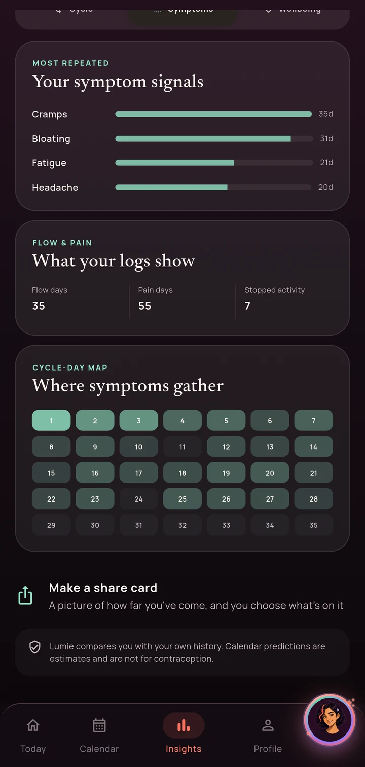
Symptoms shows what repeats most, with the day count beside it, and a map of where in the cycle it clusters. This is the answer to “is it always around day three?” and to “am I imagining that this got worse?”. It also separates flow days from pain days from days something actually stopped you, because those are three different problems.
Wellbeing compares this cycle against your own usual rather than against a population, and marks a PMS window when the same stretch keeps repeating. Being told that your symptoms are on seven days this cycle against your usual thirteen is worth more than being told what is typical for a stranger.
None of it is a diagnosis and the app never phrases it as one. It is your own record, counted and sorted, which is exactly what is hard to do in your head.
A picture of how far you have come
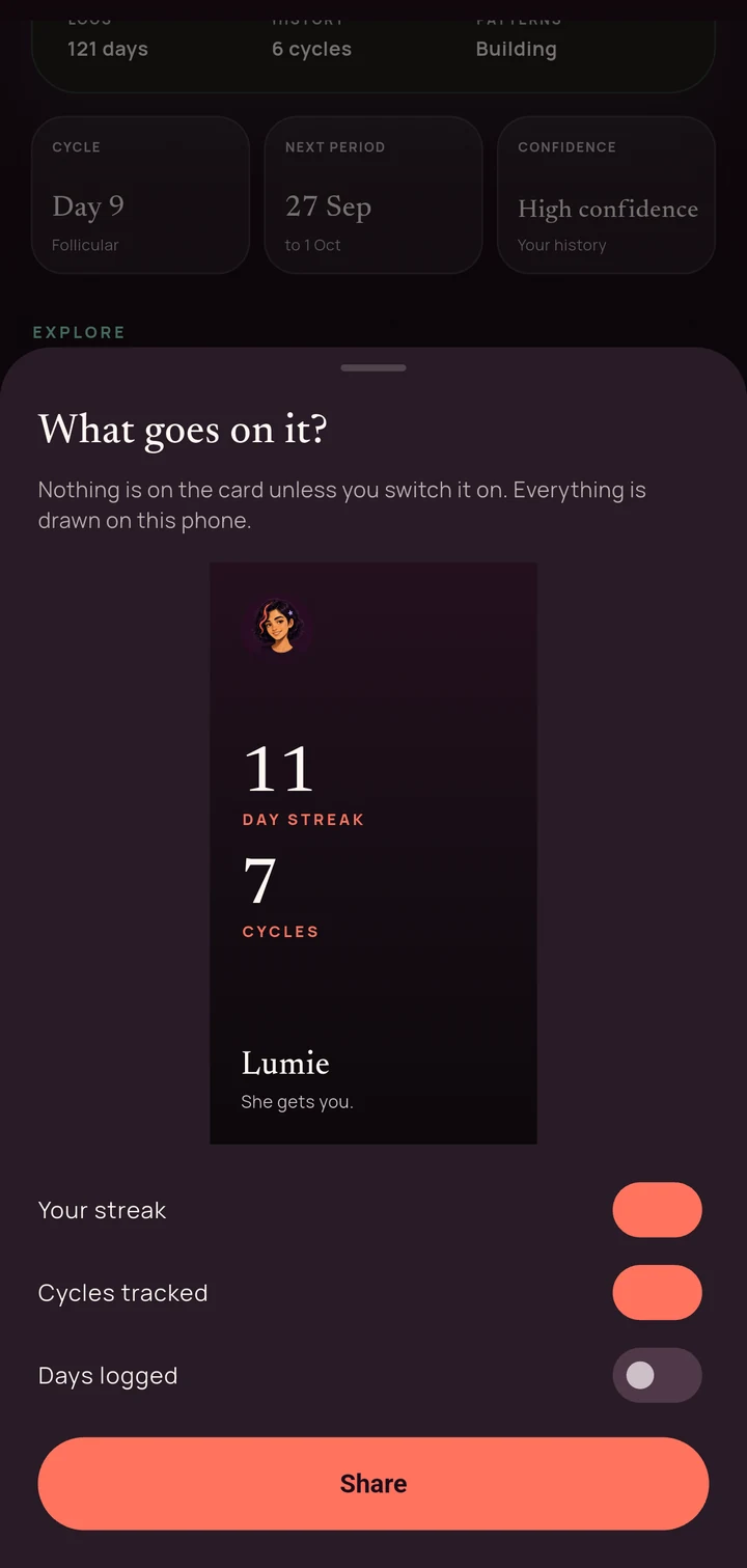
FreeA small card you can save or send, built entirely on your phone. You pick what goes on it, one switch per line, and nothing is on it unless you switch that line on.
It carries counts and nothing else. Your streak, your cycles tracked, your days logged. No dates, no symptoms, no notes, no phase. There is deliberately nothing on it that would tell somebody where in your cycle you are, because a thing designed to be shared should not leak the thing you are most careful with.
Her
A tracker records. This is the part that answers.
Lumie is the reason the app exists. Everything above this section is a good period tracker; this section is the part that reads it back to you in a voice that already knows your last three months.
She remembers
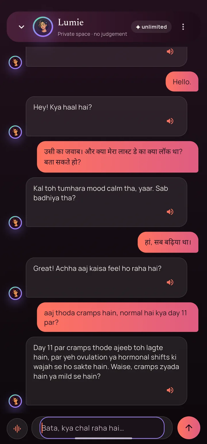
Freeunlimited on premiumNot “remembers” as a feature word. She brings up the symptom you logged yesterday, what was happening on this same cycle day one cycle ago, and a symptom that keeps landing in this phase, with the count attached, so you can tell whether four out of six is a pattern or a coincidence.
She reads what you actually wrote, not just the labels you tapped. If you noted that a bad day was about a row at home rather than about your body, she has that too, and she will not explain your feelings away with hormones. That is a rule in her prompt, not a hope.
The conversation is kept for good, on your phone, and it is the same memory whether you typed it or said it out loud. Incognito turns the writing off while she can still read: she keeps up with the conversation, and nothing new is stored.
She answers in the language you set the app to, English or Hinglish, and follows you if you switch mid conversation. Five conversations a day are free. Premium removes the ceiling.
If you say something that sounds like a crisis, she stops being a chatbot. No model is called at all. You get a card with a real helpline you can dial, and it recognises the words in both scripts people actually type them in, not only in English.
Talking out loud
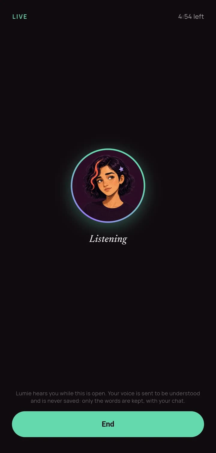
PremiumOpen it and just talk. There is no button to hold down. She hears when you have finished and answers out loud, with both sides captioned on screen as they go, in English or Hinglish.
This is the same Lumie, with the same memory. Something you said out loud on Tuesday is there when you open the keyboard on Thursday, because there is one conversation and two ways into it.
Your voice is sent to be understood and is never stored. Only the words survive, in the same place your typed chat lives, on your phone. The screen says so while you are talking rather than in a policy you have to go and find.
A countdown is always visible, so a session never ends as a surprise. When one does end, the app says which thing ran out, your minutes, the network, or the microphone permission, instead of shrugging.
- How it works
- Hands free, one turn at a time
- Languages
- English and Hinglish
- Memory
- The same one your typed chat uses
- Costs
- Premium, and free for your first 30 days
Letting people in
Two very different people, and the app treats them differently: a clinician who needs a page, and someone close to you who needs a little.
Neither of them gets your app. They get something you built for them, once, with everything you did not choose to include left out rather than hidden.
Something to hand your doctor
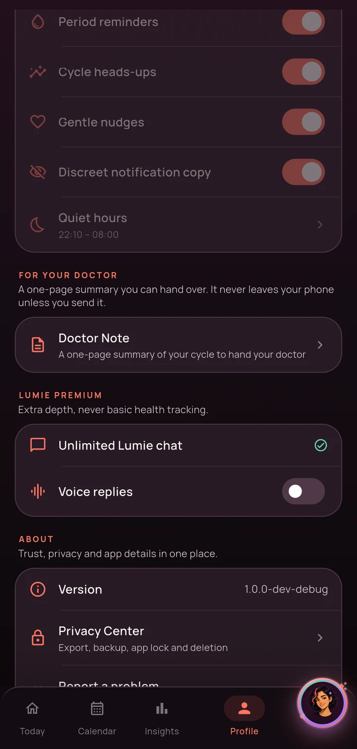
Freeday-by-day appendix on premiumOne page, built on your phone, that opens with your own questions in your words. Ten minutes goes fast and the thing you meant to ask is the thing you forget, so it goes at the top rather than at the end.
Under it: your periods and the gaps between them, your symptoms ordered by how much they cost you rather than alphabetically, and an honest line about how many days in the range actually have an entry. A note that quietly implies ninety logged days when you recorded sixty is worse than no note.
Your written notes are off by default. They are the most personal thing in the app and a PDF can be forwarded, so including them has to be a decision you make rather than one you discover.
It is always in English, whichever language you use the app in, because that is the language the consultation will be in. And the filename never carries your name, even when the page does. A filename is seen by more people than a document is.
- Range
- 3 months, 6 months, or everything
- Made
- On your phone, not on a server
- Your name
- Optional, and never in the filename
- Premium adds
- The day by day appendix
A card for someone close to you
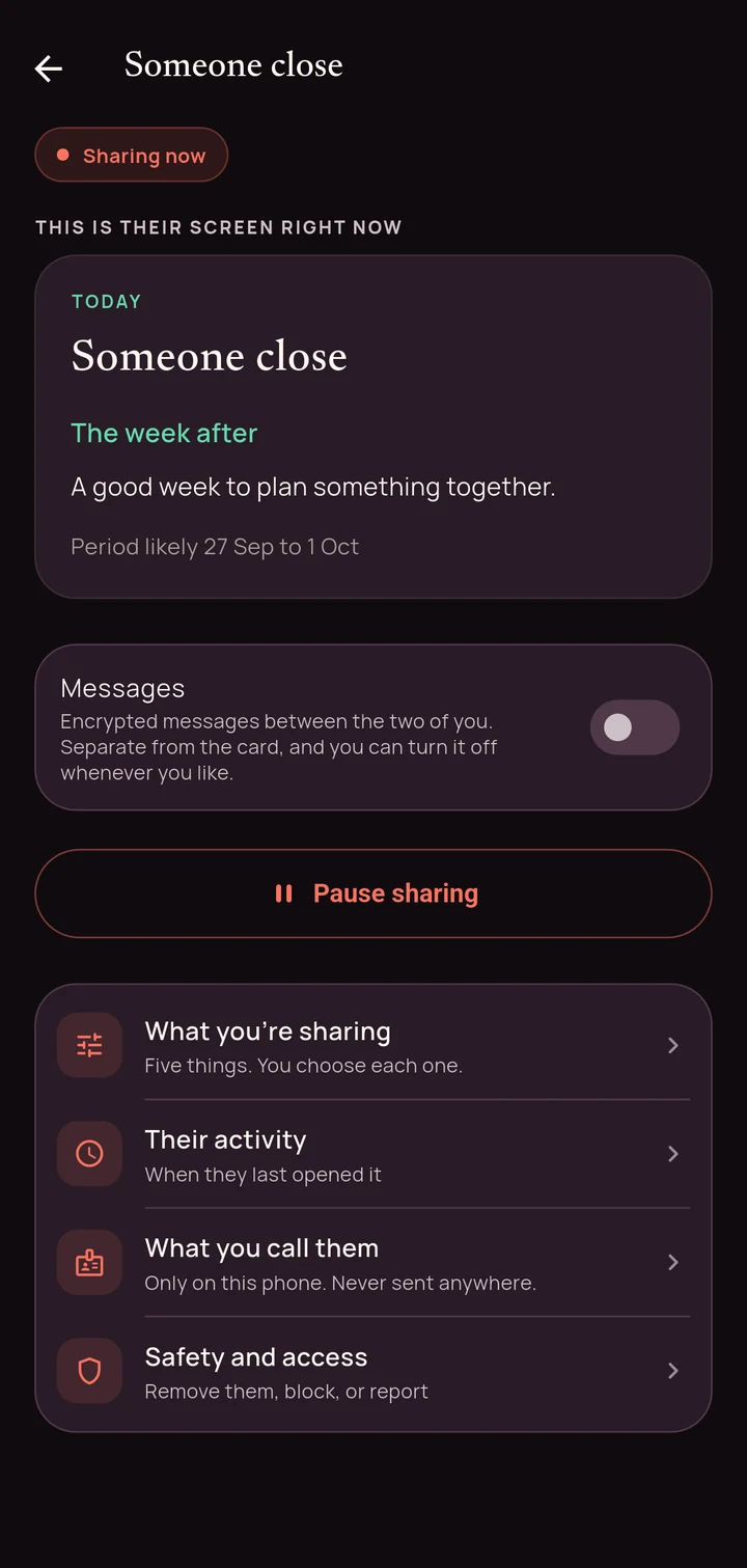
Freethree of five fields on premiumNot access to your app. A single card with five fields, each one a switch you hold. Two are on when you start. The other three are off until you decide otherwise.
The first thing on your screen is their screen. You are never guessing what they can see, because the card you are looking at is the card they are looking at.
- Where you are
- On by default
- Period window
- On by default
- Cycle day
- Off, premium
- How you feel
- Off, premium
- One thing that would help
- Off, premium
They never see your symptoms, anything you typed, anything you said to Lumie, or an exact date. Pausing is one tap with nothing to confirm, because the moment you need it is not a moment for a dialog.
You can see when they last looked and how often. They can never tell whether you looked at anything, and the app tells them that on their side rather than keeping it quiet. When you pause, unlink, or switch every field off, what they get is the same quiet card either way, so stopping is not something they can detect.
Removing them takes their card away and stops it there. Blocking also stops that person linking to you again, even if they get hold of a future code. Neither one sends them anything.
And a conversation, if you want one
FreeMessages are off until you turn them on, and they are separate from the card. Sharing how your week is going does not have to mean opening a channel, and opening one does not have to be permanent.
The two phones agree a key between themselves and we never hold it. What reaches our database is sealed bytes. That is not a promise about our intentions, it is a property of the design. There is nothing here for us to decrypt, hand over, or scan.
Photos go the same way, and even the filename is inside the encryption. The server is a letterbox rather than an archive: a message is gone from it once the other phone has it.
“You have a new message.”
Every notification, every time. The message is never in it.
On your terms
The settings that are really promises.
Most apps put privacy in a policy. Lumie puts it in switches you can reach, defaults you did not have to find, and a deletion that actually deletes.
Yours, structurally
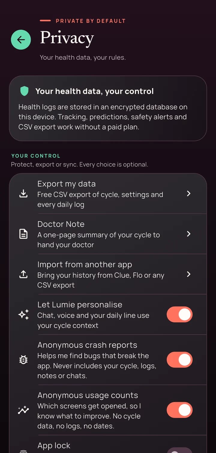
FreeWhat you log is encrypted on the phone, under a key the phone itself holds. Cloud backup is off until you turn it on, and it is the only thing that ever sends any of it anywhere.
Your rows are filed under a one way hash of your account, made on our server from a secret your phone never sees and cannot compute. There is no email column, no phone number, no address book. Even we cannot look up a person by name, because the name is not in the shape of the data.
App Lock starts locked, so no frame of your data is on screen before you have unlocked it, and it hides the app from the recent apps carousel too.
Lumie's use of your context is a switch as well. Turn it off and everything stays on the phone. Crash reports and usage counts are separate switches again, they are named on the privacy screen during setup rather than buried, and neither ever carries your cycle, your logs, your notes or your chats.
You can take everything out as a CSV, and you can delete it, the device copy, the server copy, or the whole account, as three separate decisions. The privacy policy spells out exactly what leaves and when, and you can delete your account from here without installing anything.
Bring your history with you
FreeIf you have been tracking somewhere else, you do not have to start from zero. Lumie imports a CSV export from Clue, Flo, or any app that will give you one, and folds those cycles into the same predictions it builds from the days you log here.
That matters more than it sounds. Predictions get better with history, and an app that makes you throw yours away is asking you to be a new user for six months.
The file is read on your phone. It is not uploaded anywhere to be parsed.
Reminders that do not announce you
FreeFour you set: a daily check in, a heads up before your period, a note when it ends, and birth control. Five more she works out herself, including your fertile window opening, a nudge when a prediction has just got sharper, and a quiet one if you have not logged for a while.
You get one a day, whichever matters most. Nine notifications firing at once is how a period app gets muted, and a muted app stops delivering the one that mattered.
“A quiet moment for yourself, whenever you are ready.”
Discreet mode is on by default, so a lock screen never spells out what the reminder is about. Quiet hours are respected, and your time zone is read again every time, so a flight does not leave your reminders behind.
English and Hinglish, and how it looks
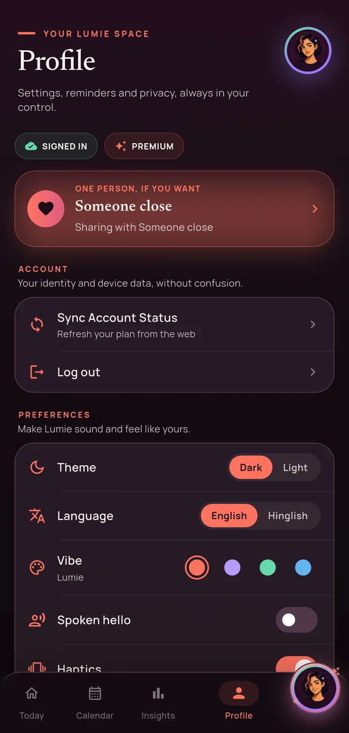
FreeThe whole app, not a menu label. Every screen, every reminder, every one of Lumie's replies, in Roman script Hinglish or in English. You can switch during setup, from the header on any onboarding screen, or later from your profile.
It is a real second version rather than a translation layer over an English one. Lumie has two ways of speaking, and the Hinglish one is not the English one with words swapped, because the warmth in Hinglish lives in words that have no English equivalent.
Dark or light, and four accent themes. A theme recolours the app around your cycle. It can never recolour the cycle itself, which is why the calendar means the same thing whichever one you pick.
Almost all of it is free.
Make an account and the first 30 days are everything, with no card and nothing to cancel.